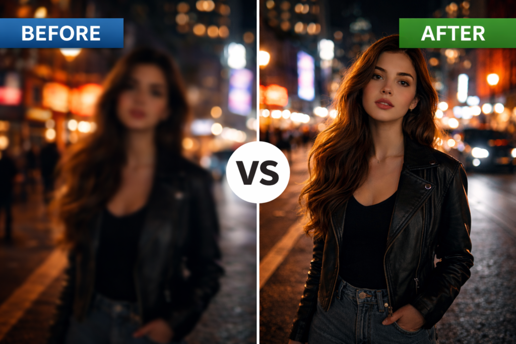
Color grading is one of the biggest differences between amateur footage and professional-looking videos. You can shoot with an expensive camera and still end up with footage that looks flat and uninspiring. On the other hand, creators often make videos look cinematic using affordable cameras because they understand how to color grade video for a cinematic look.
If you’ve ever watched a movie and wondered why it feels more emotional, dramatic, or immersive than ordinary footage, color grading is a major reason why. The colors, contrast, shadows, highlights, and overall mood are carefully crafted to tell a story and evoke emotions.
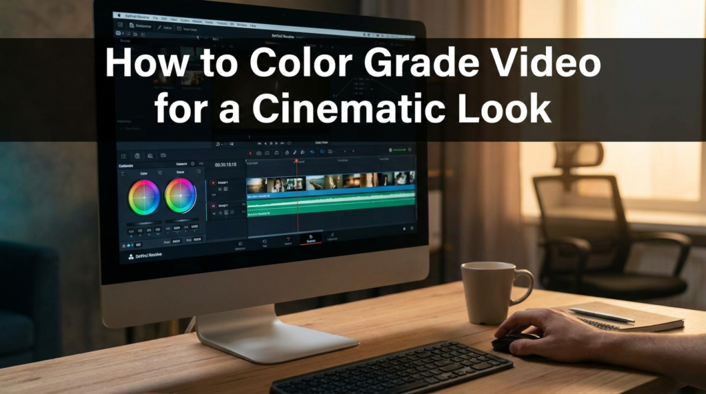
The good news is that cinematic color grading isn’t reserved for Hollywood productions anymore. Modern software like DaVinci Resolve, Adobe Premiere Pro, Final Cut Pro, and CapCut gives creators powerful color tools that were once only available in professional studios.
In this guide, you’ll learn a practical, step-by-step workflow that you can apply immediately to your own videos.
Table of Contents
What You Need Before Starting
Before touching any color wheels or LUTs, you need the right foundation.
Many beginners think color grading is about applying a cinematic LUT and exporting the video.
Professional color grading starts before you even press the record button.
Properly Exposed Footage
The best color grades begin with footage that has:
- Good exposure
- Balanced highlights
- Controlled shadows
- Minimal noise
Footage that is too dark or too bright is much harder to grade successfully.
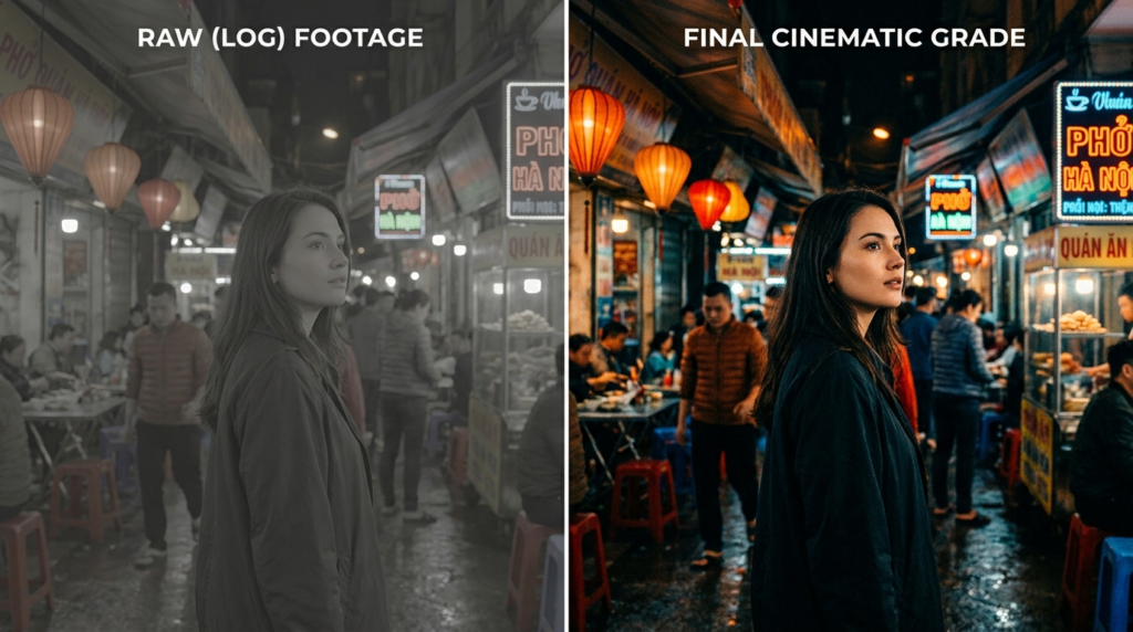
A Camera That Shoots Log or Flat Profiles
While not mandatory, shooting in a Log profile gives you significantly more flexibility.
Examples include:
- S-Log (Sony)
- C-Log (Canon)
- D-Log (DJI)
- V-Log (Panasonic)
- F-Log (Fujifilm)
These profiles preserve:
- Dynamic range
- Highlight detail
- Shadow information
This provides more room for creative grading.
Editing Software
Recommended options include:
Beginner-Friendly
- CapCut
- Wondershare Filmora
Intermediate
Professional
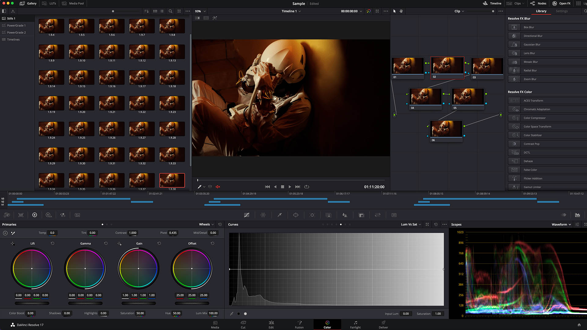
DaVinci Resolve is widely considered the industry standard for color grading.
A Calibrated Monitor
Color accuracy matters.
If your monitor displays inaccurate colors, your final export may look completely different on other devices.
At minimum:
- Lower excessive brightness
- Use a neutral color profile
- Avoid editing in overly bright rooms
Understanding Color Correction vs Color Grading
One of the biggest mistakes beginners make is confusing these two processes.
Color Correction
Color correction fixes technical problems.
Examples:
- Exposure issues
- White balance problems
- Incorrect skin tones
- Contrast inconsistencies
Think of color correction as making footage look natural.
Color Grading
Color grading creates emotion and style.
Examples:
- Warm sunset look
- Dark cinematic mood
- Teal and orange blockbuster look
- Vintage film appearance
Think of grading as making footage look artistic.
The Professional Workflow
Professionals follow this order:
- Exposure correction
- White balance correction
- Contrast correction
- Skin tone correction
- Creative color grade
- Final refinements
Skipping correction often leads to poor-looking grades.
Step-by-Step Process: How to Color Grade Video for a Cinematic Look
This workflow works for almost any editing software.
Step 1: Correct Exposure
Start by balancing the image.
Adjust:
- Highlights
- Shadows
- Whites
- Blacks
Goal: Recover detail while maintaining natural contrast.
Ask yourself: Can I see detail in both bright and dark areas? If not, adjust before moving on.
Step 2: Fix White Balance
Incorrect white balance ruins cinematic color grading.
Common issues:
- Footage too blue
- Footage too orange
- Mixed lighting conditions
Adjust temperature and tint until skin tones appear realistic.
A simple rule: If skin tones look strange, viewers will notice immediately.
Step 3: Create Strong Contrast
Movies often feature a stronger contrast than unedited footage.
Adjust:
- Blacks slightly downward
- Highlights carefully upward
The goal: Create depth without losing detail and avoid crushing shadows completely.
Step 4: Build Your Color Palette
This is where the cinematic look begins.
Professional filmmakers intentionally choose colors that support storytelling.
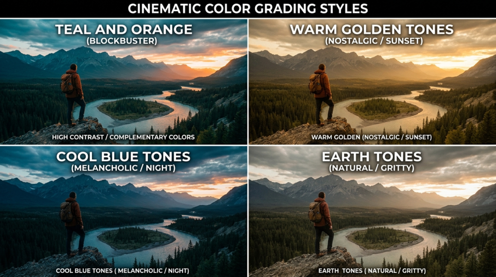
Popular cinematic palettes include:
Teal and Orange
Most famous Hollywood look.
- Warm skin tones
- Cool backgrounds
Creates subject separation.
Warm Golden Tones
Perfect for:
- Travel films
- Lifestyle videos
- Emotional storytelling
Cool Blue Tones
Perfect for:
- Sci-fi projects
- Urban videos
- Moody sequences
Earth Tones
Perfect for:
- Outdoor content
- Documentary filmmaking
- Adventure videos
Step 5: Adjust Color Wheels
Color wheels give precise control over:
- Shadows
- Midtones
- Highlights
A common cinematic approach:
Shadows
Add a slight blue or teal.
Midtones
Keep neutral.
Highlights
Add warmth.
This creates a subtle color contrast throughout the image.
Step 6: Refine Skin Tones
Nothing destroys a cinematic look faster than bad skin tones.
Check:
- Faces
- Hands
- Arms
Skin should appear natural regardless of the overall grade.
Professional colorists often spend more time on skin than on anything else.
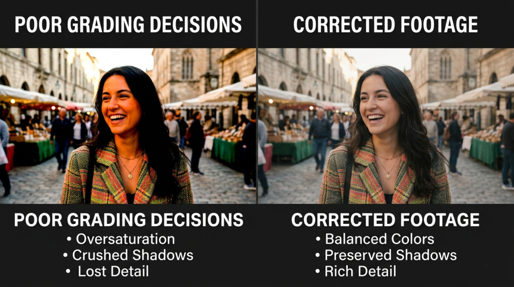
Step 7: Reduce Saturation Slightly
Many beginners oversaturate footage. Movies usually use restrained saturation. Instead of increasing overall saturation:
Adjust individual colors selectively.
This creates a more sophisticated image.
Step 8: Add Filmic Fade
Digital cameras often produce very harsh blacks.
A subtle cinematic fade can create:
- Softer shadows
- More film-like appearance
- Greater perceived dynamic range
Avoid excessive fading.
Subtlety is key.
Step 9: Add Film Grain
Film grain can make footage feel more organic.
Benefits:
- Adds texture
- Reduces digital appearance
- Creates a nostalgic feel
Use sparingly.
Too much grain creates a distraction.
Step 10: Apply Final Refinements
Review:
- Contrast
- Colors
- Sharpness
- Skin tones
Ask yourself: Does this grade support the story?
Cinematic grading should enhance storytelling and not distract from it.
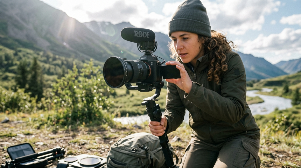
Camera Settings and Workflow Tips
Great color grading begins during filming.
Shoot in Log When Possible
Log footage captures:
- More dynamic range
- Better highlight retention
- More color information
This gives you greater flexibility in post-production.
Protect Highlights
Highlights are difficult to recover once clipped.
When filming:
Expose for bright areas first.
You can often recover shadows later.
Use Manual White Balance
Avoid Auto White Balance whenever possible.
Manual settings provide:
- Consistency
- Easier grading
- Better color matching
Use ND Filters Outdoors
ND filters allow:
- Proper shutter speed
- Better motion blur
- Cleaner cinematic footage
Organize Your Footage
Professional workflow:
- Import footage
- Organize clips
- Color correct
- Grade
- Export
Organization saves enormous time later.
Real-World Mistakes to Avoid
Applying LUTs and Exporting Immediately
A LUT is not a magic solution.
Every clip requires adjustment after LUT application.
Overusing Teal and Orange
The teal-and-orange look can become excessive quickly.
Subtle adjustments look far more professional.
Ignoring Skin Tones
Viewers instinctively notice skin tone issues.
Always prioritize natural-looking faces.
Crushing Shadows
Deep black shadows may look dramatic, but often destroy detail.
Maintain texture whenever possible.
Saturating Every Color
Professional color grading rarely involves excessive saturation.
Focus on color harmony instead.
Grading on an Uncalibrated Screen
What looks great on your monitor may look terrible elsewhere.
Use consistent display settings.
Pro Tips to Improve Results
Study Movies Frame by Frame
Pause movies and analyze:
- Color palette
- Contrast
- Lighting
- Skin tones
This trains your eye faster than tutorials alone.
Use Reference Images
Professional colorists constantly compare their work to references.
Create a folder of:
- Movie stills
- Commercials
- YouTube creators you admire
Learn Basic Color Theory
Understanding complementary colors helps create more intentional grades.
Popular combinations:
- Blue and orange
- Green and magenta
- Yellow and blue
Create Your Own LUTs
Be creative. Once you develop a style:
Save it as a LUT.
Benefits:
- Consistency
- Faster workflow
- Stronger personal brand
Focus on Storytelling
The best cinematic grade isn’t the most dramatic.
It’s the one that best supports the story.
Ask:
“What should the audience feel?”
Then grade accordingly.
FAQ
How do professionals color grade videos?
Professionals first color correct footage, then apply creative color grading using contrast adjustments, color wheels, curves, and selective color modifications.
What software is best for cinematic color grading?
DaVinci Resolve is the most widely used professional color grading software, though Premiere Pro and Final Cut Pro are also excellent options.
Do I need Log footage for cinematic color grading?
No, but Log footage provides significantly more flexibility because it retains more dynamic range and color information.
Why does my footage look worse after color grading?
Common reasons include over-saturation, excessive contrast, crushed shadows, incorrect white balance, or poor exposure.
What is the easiest cinematic color grade for beginners?
A subtle teal-and-orange look combined with proper contrast and natural skin tones is often the easiest starting point.
Can I color grade videos on my phone?
Yes. Apps like CapCut, VN, and Lightroom Mobile provide enough tools to create basic cinematic color grades.
Internal Linking Suggestions
📚 Learn Articles
- “What Is Dynamic Range in Cameras? Simple Explanation”
- “Photography Composition Rules Every Beginner Should Learn”
🎥 Gear Articles
- “Best Budget Camera for Beginners in Photography”
- “Best Lenses for Portrait Photography (Beginner to Pro)”
Pillar Guide
📚 Educational books
- The Beginner’s Guide to Digital Photography (2026 Edition): Master Exposure, Composition & Lighting in 30 Days: A Step-by-Step Manual Mode Guide for DSLR & Mirrorless Cameras + Printable Cheat Sheets Kindle Edition
- Cinematic Lighting for Beginners: Practical Setups & Step-by-Step Guides
Conclusion
Learning how to color grade video for a cinematic look is one of the highest-impact skills you can develop as a creator. A great color grade can elevate ordinary footage, strengthen storytelling, and instantly make your videos feel more professional.
Remember the professional workflow:
- Color correct first
- Build contrast
- Create a color palette
- Refine skin tones
- Add cinematic finishing touches
Most importantly, focus on subtle improvements rather than dramatic changes. The best cinematic grades often feel invisible because they naturally guide the viewer’s emotions without drawing attention to the editing itself.
Start practicing with your next project, experiment with different color palettes, and develop a style that reflects your creative vision. Over time, color grading will become one of the most powerful tools in your filmmaking workflow.